

There following are top 10 electrical logos with simple designs and extremely significant in many ways.
This logo is designed with electricity distribution pole and lines. It is obvious that the company is in the power supply. It is designed with sky blue and white colour with a brown background with a little dark brownish circle in the middle.

This logo is designed with the symbol of currents moving from one destination to another supplying power to appliances. It is designed with brown, yellow, green and sky blue colours. The brown colour moving from the left extreme end and the sky blue moving from the right extreme end to a conducting pointing. Here is a link to the logo: https://diylogodesigns.com/wp-content/uploads/2015/09/logo-chris-white-elect-lightbox.jpg
This logo is designed with a scroll electric bulb with a brown colour and the inscription superimposed from the middle of the base of the bulb. The implication is that this company may be into electric bulb supplies or manufacturing. Here is a link to the logo:
This company is an American multinational corporation currently operating in over forty countries of the world. The logo design is one of the simplest and best-designed logos in the world.

This logo is designed with power plugins for power outlets or power inlet. It is designed with white colour and black background. It is assumed the power brightens the darkness hence the black background and the white inscription.
This logo is designed with an electric bulb and a face of a person on one side. Just as the name implies. It is assumed that the brain of a person has some inherent powers that discharge itself like currents and supplying energy to other parts of the body.
This custom logo is designed with the name with a star directly above it. The star is designed with blue colour. From the left, it is sky blue and from the right, it is navy blue. The name of the company used for the designed is also so coloured, sky blue from the left and navy blue from the right on a white background.
This logo is designed with a “B” like design, however, the curve of the B is a power plugin. Its write up is white in colour meanwhile it is designed on a royal blue background. It is quite a simple logo.

This logo is designed on a navy background with some light contrasts in the middle of the background. Superimposed on the background is an electric bulb with half of the moon or an eclipse sign. The bulb and eclipse sign is designed with white colour.

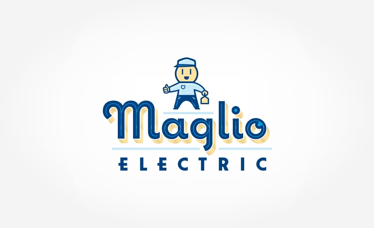
This logo is designed on a grey/ash background. On the background is an electric man with power testing equipment on one hand. Directly under the power man is the write-up of the design using the company name. The name is designed with navy blue, sky blue tin line with a light brown shadow to the right.
If you have your own electrical company and want a logo design too, contact one of our local team in Sydney, Wollongong, Newcastle, Melbourne & Perth. Click here to contact us.
Hey, I'm Callum. Here at Creato we re determined to produce creative . My only questions is, will it be yours?

Callum is the founder of Creato, a Sydney based design agency that specialises in creating holistic brands for Aussie businesses.
With a talent for crafting memorable and effective branding solutions, Callum has built Creato into a respected and successful agency. His work has been featured in various publications, including The Huffington Post, BuzzFeed, and Entrepreneur.
If you re interested in working with Callum and Creato to bring your brand to the next level, don t hesitate to get in touch!
Logo Package