Published
Author

Callum
Categories
Logo design

Ready to take it a step further?
Let's start talking about your project or idea and find out how Creato can help your business grow.
A logo can look excellent across the top of a proposal and become almost unreadable inside a social media profile picture. The design may be sound. The space has changed.
Logo variations give you approved ways to handle those changes. A useful set might include a wide layout, a compact layout, a small symbol and versions for light and dark backgrounds. The right combination depends on where your business actually appears.
This guide explains what each variation does, which ones are worth asking for and how to test them before you approve your logo design.
What are logo variations?
Logo variations are related versions of the same identity, adapted for different spaces, sizes or backgrounds. They keep recognisable features such as the lettering, symbol and proportions while changing the arrangement or level of detail.
Think of a logo system like a set of tools made for the same job site. A compact tool reaches places the larger one cannot. You choose the version that suits the conditions rather than forcing the biggest one into every space.
Designers may call these arrangements lockups. A lockup fixes the relationship between the symbol, business name and any supporting wording. A responsive logo system includes versions that remain clear as the available space changes. Your website developer still needs to implement the appropriate version; the logo does not automatically redesign itself.
There is also a practical distinction between a variation and a file format. A horizontal logo is a variation. SVG and PNG are formats in which that variation might be supplied. Our guide to logo file formats explains the delivery side in more detail.
The logo variations worth considering
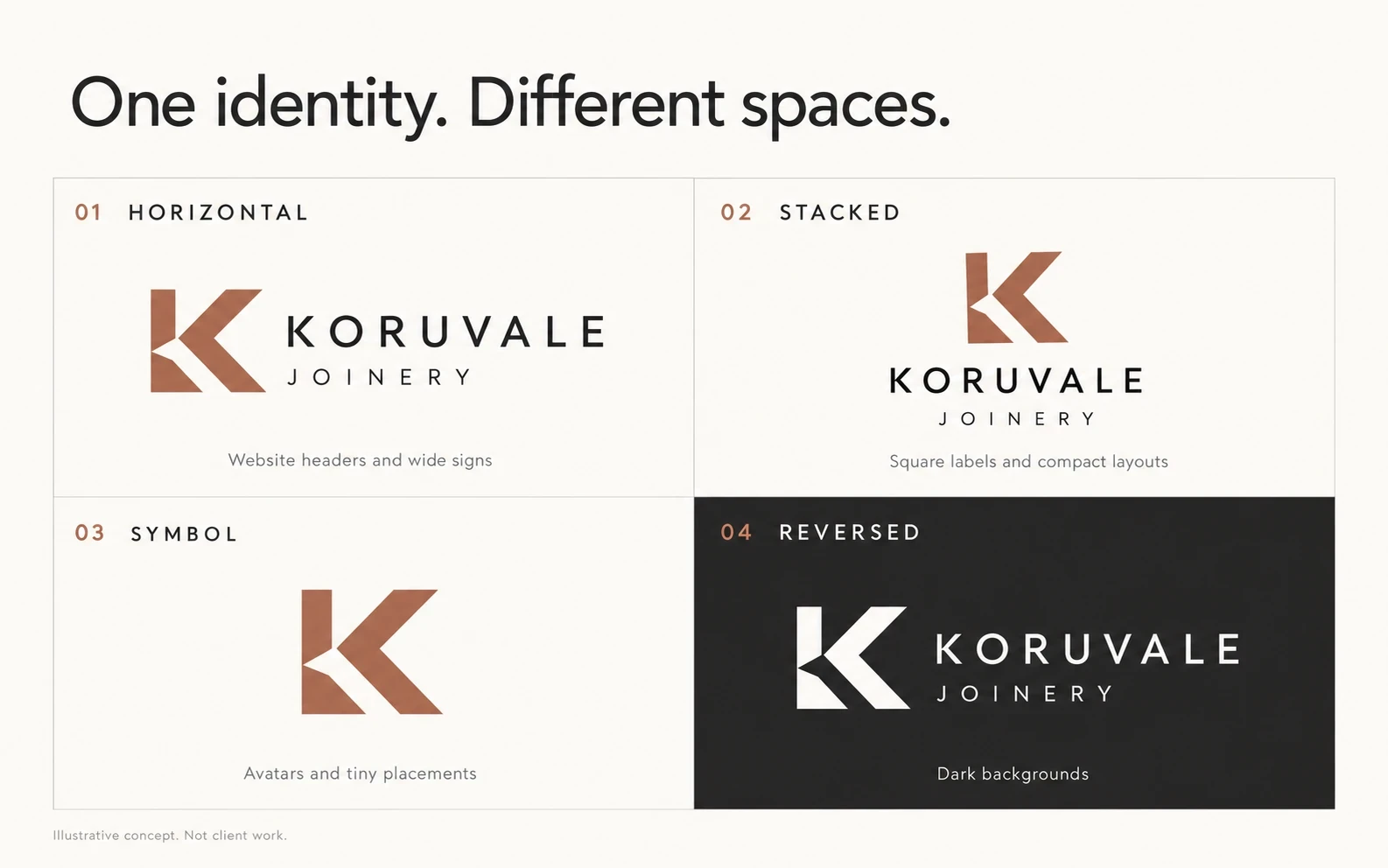
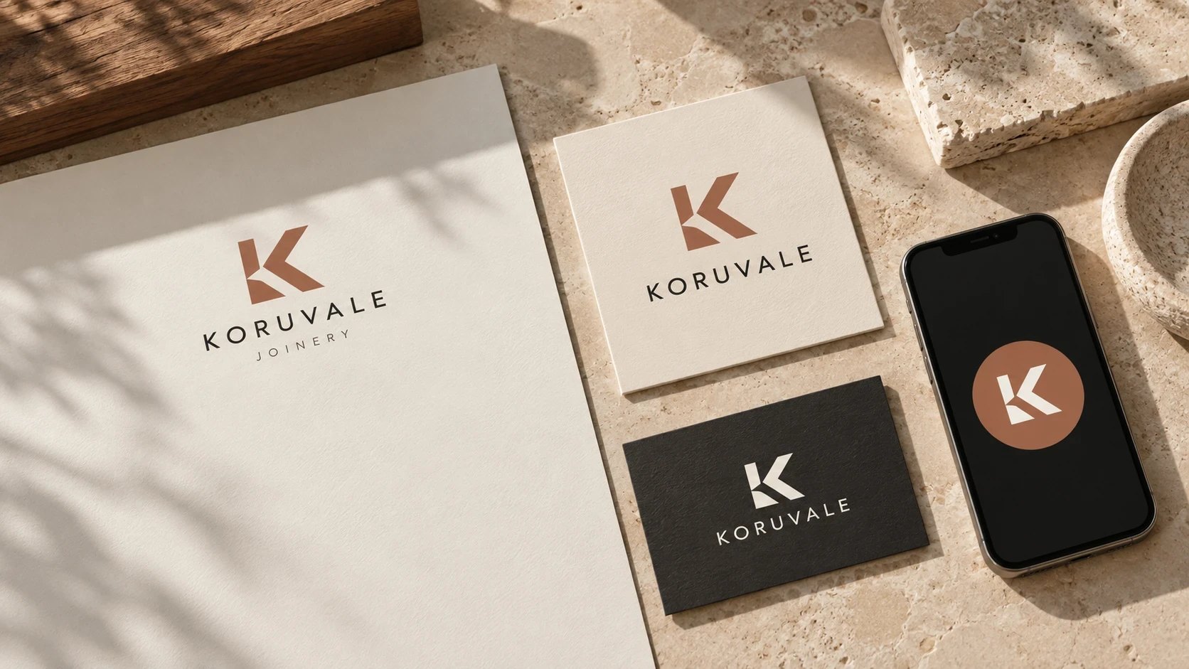
Koruvale Joinery is a fictional identity created to illustrate this guide. These AI-generated visuals are illustrative concepts, not Creato client work.
1. A primary logo for everyday recognition
Your primary logo is the preferred version when the available space allows it. It should communicate the business name clearly. Depending on the design, it might be a wordmark, a symbol paired with the name, or a more compact arrangement.
“Primary” describes its role, not its shape. It does not have to be horizontal, and it does not need a tagline. For a new business, keeping the name readable is usually more useful than packing every service into the logo.
2. A secondary layout for a different shape
A secondary logo rearranges the same elements to suit another space. If your primary logo is wide, the secondary might stack the symbol above the name. If your main logo is tall, you might need a horizontal option for a website header.
Imagine a joinery business with a long vehicle panel and a square sample label. A wide layout can use the vehicle panel comfortably. A stacked layout gives the name more room on the label. Simply shrinking the wide logo into that square can leave most of the space unused.
3. A submark, monogram or standalone symbol
A submark is a reduced expression of the identity. It might use initials, a recognisable symbol or a compact badge. Designers use these terms differently, so ask to see the intended application rather than relying on the label alone.
This version can suit social avatars, packaging seals and repeat details. It also needs context. An unfamiliar symbol on a roadside sign may give a new customer no clue whose business they are looking at. The same symbol beside your account name on a social profile is easier to connect with the business.
4. A version designed for very small display
A browser favicon has a much smaller job than a shop sign. Fine outlines, tightly spaced initials and small descriptors may disappear when reduced. A small-size version may need fewer details, more open internal spaces or adjusted line weights.
This is worth checking even when the artwork is vector. Adobe explains that SVG artwork can scale without losing resolution, but a perfectly sharp shape can still be too intricate to read.
Your designer and developer should also check the destination’s current requirements. For example, Google’s favicon guidelines call for a square image and recommend a size larger than 48 × 48 pixels. The uploaded file size and the size people see on screen are different considerations.
5. Colour, single-colour and reversed versions
These solve background and production problems. A full-colour logo may suit a white proposal. A single-colour version can work for a stamp or a restricted print process. A reversed version uses light artwork on a dark background.
Colour versions should be deliberately prepared and tested. Automatically turning a coloured mark grey can merge shapes that previously relied on colour to stay separate. Reversing a detailed mark can also change how heavy its lines appear.
Layout and colour are separate choices: a horizontal logo might be available in full colour, black and white. Receiving those three files does not mean you have three different layouts.
How many logo variations does your business need?
Start with a list of real uses. There is no universal requirement to commission four layouts, and an extra badge adds little if nobody needs it.
A consultant or professional service: prioritise a readable name on proposals, invoices and the website, with a compact option for a profile image and favicon.
A trade business: check vehicle signage, uniforms, quotes and supplier boards. The embroidery version may need different preparation from the sign artwork.
A café or product business: test the shopfront, packaging labels, cups, delivery-platform thumbnail and social avatar. A seal can be useful if it serves a genuine packaging need.
A concise working set might be a primary layout, one alternate arrangement and a small mark, with the colour options each application needs. A straightforward wordmark may need fewer variations.
There are useful real-world examples of controlled flexibility. Aspect’s published brand guidelines distinguish a master logo, a stacked logo and a supporting symbol, then specify where each belongs. The lesson is the decision-making: different versions are more useful when people know when to use them.
A worked example: one joinery business, four placements
For the fictional Koruvale Joinery identity shown above, the lettering and angular K provide the common thread. Here is how we would test the system:
Website header: use the horizontal lockup, keeping the business name readable alongside the navigation.
Square sample label: use the stacked version so the name can occupy more of the available width.
Social profile: use the symbol in a circle-safe area, with the account name providing the wording alongside it.
Dark business card: use the approved white version, with enough clear space around the mark.
The symbol-only version would not automatically become the choice for every small item. On a first-contact flyer, the full business name matters. On a tiny browser tab, the symbol can act as a recognition cue. The surrounding information helps decide.
Five tests to run before approving your logo
Check it at the size customers will see
Review the website header on a phone, the avatar in a feed and the business card printed at its intended size. A large presentation board can hide weaknesses. For early digital testing, compare the small mark at 16, 32 and 48 pixels; these are useful test sizes, not universal platform specifications.
Test the crop as well as the dimensions
A square image may be displayed inside a circle. Keep important details away from the crop boundary and preview the actual result. Avoid solving a poor fit by squeezing the lettering or cutting off part of the name.
Use the real backgrounds
Check light and dark versions against your website colours, uniform fabric and typical photography. The logo should remain easy to distinguish. If the background is busy, choose a quieter placement or an approved holding shape rather than adding an improvised outline or shadow.
Ask the production supplier for a proof
Embroidery, engraving, cut vinyl and small printed labels have different constraints. Send the intended artwork and finished dimensions to the supplier. Ask whether fine details will hold, whether anything needs simplifying and whether a physical sample is appropriate before a larger run.
Review the set together
Place every variation on one page. Check that the symbol, letterforms, spacing and colours still belong to the same identity. A secondary layout should feel related immediately. If each version introduces a different visual idea, the set needs more work.
What to ask for at handover
Agree on the required applications before design begins, then check that the final handover contains:
The approved layouts and colour treatments, clearly named.
Vector artwork and practical exports for the agreed digital and print uses.
Minimum-size and clear-space guidance for each relevant version.
A simple explanation of which version belongs where.
Any supplier-specific artwork agreed in the project scope.
Clear file names such as “Koruvale-horizontal-white” help more than “logo-final-7”. Keep an untouched master folder and share the appropriate export with each supplier.
The logo files are the assets. A brand style guide records how to use them consistently alongside your colours, typography and other design elements. They serve different purposes.
Common questions about logo variations
Is a secondary logo a different logo?
It is usually an alternate arrangement of the same identity. The business name, lettering and symbol should remain recognisably connected. A separate brand or product identity is a different design decision.
Can every business use a symbol-only logo?
A symbol can be useful when the business name appears nearby or the audience already recognises it. For unfamiliar audiences, keep a version with the name available. Some identities work best as wordmarks and do not need a separate symbol.
Do I need a complete redesign to add variations?
Sometimes the existing artwork can support a carefully designed alternate layout. Other logos need refinement to work at small sizes or in one colour. A designer should assess the source artwork and intended uses before recommending the scope.
Build a logo around the places it needs to work
Bring your actual applications into the conversation: your website header, a uniform sample, a vehicle panel, a label or a proposal cover. They give your designer something concrete to solve.
Creato’s logo design service starts with your business and the identity you need to build. If you are planning a new logo or reviewing an existing one, send us your project details and the places it needs to appear so we can discuss the right scope.


