Published
Author

Callum
Categories
No items


Ready to take it a step further?
Let's start talking about your project or idea and find out how Creato can help your business grow.
Ten familiar brands and practical lessons for your next logo
Try drawing a familiar logo before you look it up. You may feel certain about the brand, then hesitate over a tiny detail. Which way does the leaf point? How many lines belong in the symbol? Is that colour part of the logo or the packaging around it?
For a business owner, that hesitation raises a useful design question: what should people carry away from your identity after a brief encounter? A clear silhouette, a distinctive colour combination or an unusual relationship between letters can give them something specific to recognise later. The challenge is choosing what deserves their attention.
Signs.com’s Branded in Memory study offers an entertaining starting point. The drawings invite a closer look at the difference between recognising a brand and reproducing its artwork. Here, we examine all ten brands and turn that distinction into practical questions for a new logo or a refresh.
What the logo memory study measured
Signs.com asked 156 Americans aged 20 to 70 to draw ten logos from memory. Its galleries arrange drawings by accuracy. The cross-brand ranking uses the share classed as near-perfect, a different measure from the independent judges’ average accuracy scores. IKEA led the near-perfect ranking at 30%; Starbucks recorded 6%.
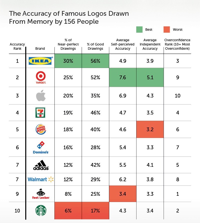
Figure 1. Comparison table from Branded in Memory by Signs.com. The near-perfect percentage ranking differs from average independent accuracy.
Treat this as an exploratory drawing exercise with a small US sample. It does not establish how Australian customers see your business, whether a logo drives sales, or which design feature caused a result. The discussion below is our design interpretation, rather than a set of causal findings from the experiment.
There is also a time gap. These are the identities examined in the original study, not a survey of today’s versions. For example, Burger King introduced a global visual identity update in 2021, and Walmart announced a brand refresh in 2025.
Ten brands worth looking at more closely
The following examples follow the study’s brand sequence. They are a design discussion, not a league table of commercial success. Open each source gallery to compare the remembered marks with the reference logo.
Apple and the value of one defining detail
Apple shows how much identity can depend on a small alteration to a familiar shape. The bite and detached leaf distinguish a particular mark from an ordinary drawing of fruit.
For your own logo, ask which small feature makes the whole recognisable. Keep that feature visible when the artwork is reduced for a browser tab or reproduced in a single colour. Adding several equally prominent details can make this decision harder. A simple mark still needs a deliberate difference; a generic outline alone gives customers little to connect specifically with your business.
The supplied gallery includes whole apples, added stalks and differently placed bites. In the more accurate drawings, the distinctive silhouette becomes clearer. Remembering the object and remembering the exact mark are separate tasks.

Figure 2. Apple drawings from memory. Source: Signs.com, Branded in Memory. View source.
Adidas and the need to identify a specific version
With Adidas, first be clear about which mark you are discussing. Its visual family shows how a company can have several related identities. Asking somebody to remember a brand name can leave room for more than one visual answer.
The black treatment also separates shape from colour. A smaller business should make its own visual relationships equally clear. Decide when to use the full name, when a symbol can stand alone and how a sub-brand fits. Document those choices for staff and suppliers. If your social profile, website and uniforms use unrelated interpretations, reviewing the consistency of the system may be a better starting point than drawing another logo. Ask customers which version they associate with you before replacing it.
The drawings include different stripe arrangements, trefoil-like forms and even shoes. Those variations make the question of which identity people have encountered especially relevant.
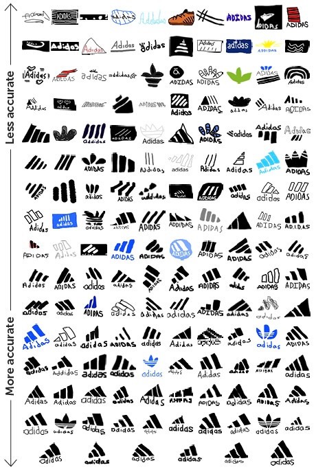
Figure 3. Adidas drawings from memory. Source: Signs.com, Branded in Memory. View source.
Burger King and a concept you can describe
The Burger King identity in the study combines the name with the idea of a burger. That relationship is worth examining separately from its decorative treatment. You can describe the concept in ordinary words, giving the design a clear structure for a viewer to follow.
Try the same exercise with your proposed identity. Explain its central idea without using the words modern, premium or professional. If the explanation depends on several hidden meanings, decide which one actually helps a customer identify you. A literal product reference is one option, although an abstract mark may suit a business that expects to expand beyond its original offering. Choose with that future use in mind.
Crowns appear among the looser interpretations, while many closer drawings place the name between bun shapes. The gallery suggests how a brand name can prompt an associated idea even when the exact artwork is uncertain.
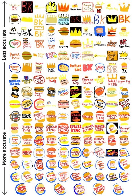
Figure 4. Burger King drawings from memory. Source: Signs.com, Branded in Memory. View source.
Dominos and the relationship between colour and geometry
A domino offers a compact vocabulary of shape, division and dots. In the Domino’s identity, red and blue add another way to distinguish the parts. Consider how those straightforward components work together.
When evaluating your own mark, separate its structure from its finish. View it in colour, then in black and white. Does it retain a distinctive arrangement in both? Consider the version a supplier will embroider on a uniform or print on a small label. If the identity becomes unclear without a precise colour match, develop an approved alternative while you still have control over the design.
In the gallery, red and blue often remain visible while the number and arrangement of dots change. Look separately at recognition of the overall tile and recall of its internal details.
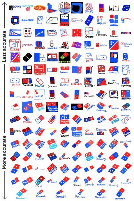
Figure 5. Domino’s drawings from memory. Source: Signs.com, Branded in Memory. View source.
7 Eleven and the hierarchy inside a busy mark
The 7-Eleven identity brings a large numeral, a word and red, orange and green into a compact space. Its value as a design example lies in hierarchy: the components have different jobs rather than equal visual weight.
A business name, symbol and tagline can quickly compete in a proposed logo. Decide what a viewer should notice first, then establish the supporting information. Test whether the name remains readable at the actual size of an email signature. If a tagline becomes a thin blur, it may need a separate position in the layout. You can keep useful information in the wider brand system without forcing every item into the smallest version of the mark.
The remembered versions shuffle the numeral, word and green frame into different arrangements. Several keep a familiar palette while changing the proportions substantially.
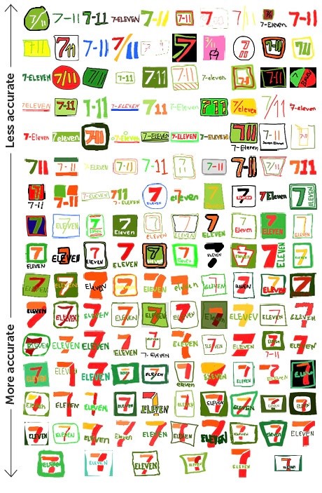
Figure 6. 7-Eleven drawings from memory. Source: Signs.com, Branded in Memory. View source.
Foot Locker and the role of a character
Foot Locker’s black-and-white referee figure gives the identity a character. A person or mascot brings different design opportunities from a geometric symbol: pose, clothing and expression can all contribute to what the brand communicates.
If a character suits your business, decide which attributes must survive at small sizes. A detailed illustration may work beautifully on a large sign and need a simplified companion for an app icon. Develop those versions together so they still look related. Also check how the character feels to the intended audience. Being able to describe a figure is useful, but its personality should fit the service customers will actually receive.
Some drawings substitute a foot, shoe or written name for the referee. Those alternatives show how a person can remember the retail category while missing a specific identifying feature.

Figure 7. Foot Locker drawings from memory. Source: Signs.com, Branded in Memory. View source.
Starbucks and recognition beyond drawing ability
Starbucks identifies the Siren as a central brand asset and prefers the logo to appear independently of the wordmark. The green circle and Siren give it more illustrative detail than a basic geometric mark.
For a designer, this raises a better evaluation question than whether somebody can copy every line: what information must remain for the intended audience to identify the brand? A drawing task places demands on visual memory and drawing ability that a quick recognition task does not. Avoid rejecting a detailed concept solely because it is difficult to sketch. Assess its legibility, distinctiveness and practical applications, and test recognition separately.
Green persists through a wide variety of faces, stars and improvised figures in the supplied gallery. The overall colour impression is visibly steadier than the Siren’s finer details, without showing that colour alone caused recognition.

Figure 8. Starbucks drawings from memory. Source: Signs.com, Branded in Memory. View source.
Walmart and continuity during a refresh
Walmart’s 2025 refresh retained the spark and a blue-and-yellow palette while changing other aspects of the identity. That choice gives designers an example of deciding what to carry forward.
Before refreshing your logo, list the elements customers already connect with your business. Ask which still work and which create genuine problems. You might improve lettering or spacing while keeping a familiar symbol. A complete change can be appropriate, but it also creates a practical rollout task across signage, documents and digital channels. Give that rollout a plan so customers do not encounter conflicting versions indefinitely.
The gallery includes smiley faces, different starbursts and wordmarks. It is worth asking whether an unexpected drawing recalls another familiar brand asset before treating it as a complete failure of memory.

Figure 9. Walmart drawings from memory. Source: Signs.com, Branded in Memory. View source.
Target and the strength of a clear visual idea
Target’s bullseye makes the relationship between name and image unusually direct. Concentric forms give the mark a structure that can be described without specialist design language. Red provides an additional visual cue.
A new business can look for a focused idea that fits its own name or positioning. Copying the surface simplicity of an established mark will not create the same association. Explore whether your concept has a specific connection to your business, then compare it with competitors’ identities. A clean circle or common symbol may be easy to draw while remaining difficult to attribute to one particular company.
The source study reports that 41% drew the wrong number of circles. Red bullseyes remain visible throughout the gallery, even where the ring structure changes. A clear concept can still leave room for inaccurate detail.

Figure 10. Target drawings from memory. Source: Signs.com, Branded in Memory. View source.
IKEA and consistency across the whole identity
IKEA combines a short name with a bold blue-and-yellow setting. The IKEA Museum’s logo history describes a long-running visual identity that has evolved through refinements, including a 2018 update for legibility and digital use.
For a smaller business, the practical question is how consistently the identity can be used. Set clear colour specifications and supply the right files for screens and print. Make approved versions easy for staff to find. If every supplier rebuilds the mark, the details will drift. Keeping one maintained set of files is a straightforward way to protect the work invested in the design.
The gallery moves from loosely written names to closer versions of the framed wordmark. Blue and yellow recur, while the surrounding oval and proportions vary. Name, palette and enclosure can be considered separately.

Figure 11. IKEA drawings from memory. Source: Signs.com, Branded in Memory. View source.
What these examples mean for your own logo
Start by choosing the element that deserves the most attention. It might be a recognisable silhouette, distinctive lettering or a particular relationship between shapes. Ask a designer to explain that choice in terms of your business and audience. A concept should have a reason to exist beyond matching this year’s visual trends.
Then examine colour as part of a system. Avoid treating a colour as a universal promise of trust, appetite or creativity. What else uses that colour in your market? Does the combination stand apart? Is there sufficient contrast in the actual application? A colour decision should survive those practical questions, along with the requirements of a one-colour version.
Keep the comparison fair. An established global brand has a history and a volume of exposure that a new local business cannot assume. You can borrow an approach to clarity or consistency without expecting to borrow the recognition attached to it. A logo also sits within a wider experience that includes your website, service and communications.
A practical way to test a new logo
Use a short review with people who resemble your intended customers. Keep the process the same for each concept, and avoid explaining the design before they respond. The exercise can reveal questions worth investigating, but a handful of opinions should not be presented as statistically representative research.
Show the logo in a realistic setting, such as a website header or shopfront. Ask what business name they read and what kind of service they expect.
After a short unrelated task, ask what visual elements they remember. Let them describe the mark as well as sketch it, so the exercise does not rely entirely on drawing ability.
Show it alongside plausible alternatives and ask which one they saw. Record confusion with competitors separately from imperfect recollection of details.
Check the production versions at real sizes, including a small screen, a single-colour print and any specialist application your business needs.
Look for repeated problems rather than treating every personal preference as a design instruction. If people cannot read the name, revisit the lettering. If they consistently confuse the mark with another business, revisit what makes it distinctive. If they recognise it but draw a small detail incorrectly, consider how much that detail matters to the identity before changing it.
Give people something clear to remember
The drawing exercise is a useful prompt to be more deliberate about what a logo asks people to notice. Give the design a clear idea, make it work in its real settings and use it consistently. Then judge it against the audience and purpose it was created for.
Related Creato pages: logo design in Sydney, logo design in Melbourne and logo design in Brisbane.
Study and images: Branded in Memory by Signs.com. The commentary here is Creato’s interpretation.


