Published
Author

Callum
Categories
Website design


Ready to take it a step further?
Let's start talking about your project or idea and find out how Creato can help your business grow.
A pricing page is where a beautiful website has to answer a very practical question: “Is this the right option for me?” These eight examples show how to make that decision feel easier.
Most customers arrive with more than a budget in mind. They want to know what is included, which option fits their situation, what could cost extra and what happens after they click. A giant price and a bright button only answer part of that conversation.
The most useful pricing-page ideas come from treating the page as a decision tool. Below, we look at eight current examples through four questions your own page should answer. The lessons work for subscriptions, packaged services and businesses that quote each project individually.
Examples checked in October 2026. These are design observations, not claims that a particular layout increased conversion. Prices, plans and interfaces change, so follow the linked pages for current commercial terms. The explanatory diagrams are original Creato illustrations, not screenshots of the brands’ websites.
In this guide
1. Find my fit
2. Compare the value
3. Understand the total
4. Take the next step
For quote-based services
The design checklist
1. Help me recognise the option for me
Before people compare features, they need a way into the decision. Start with a distinction they already understand: the size of their team, the kind of project they are planning or the job they want to get done.
Labels such as Silver, Gold and Platinum tell visitors there is a hierarchy. They do much less to explain who belongs where. A short, specific description under each name can do more useful work than another badge.
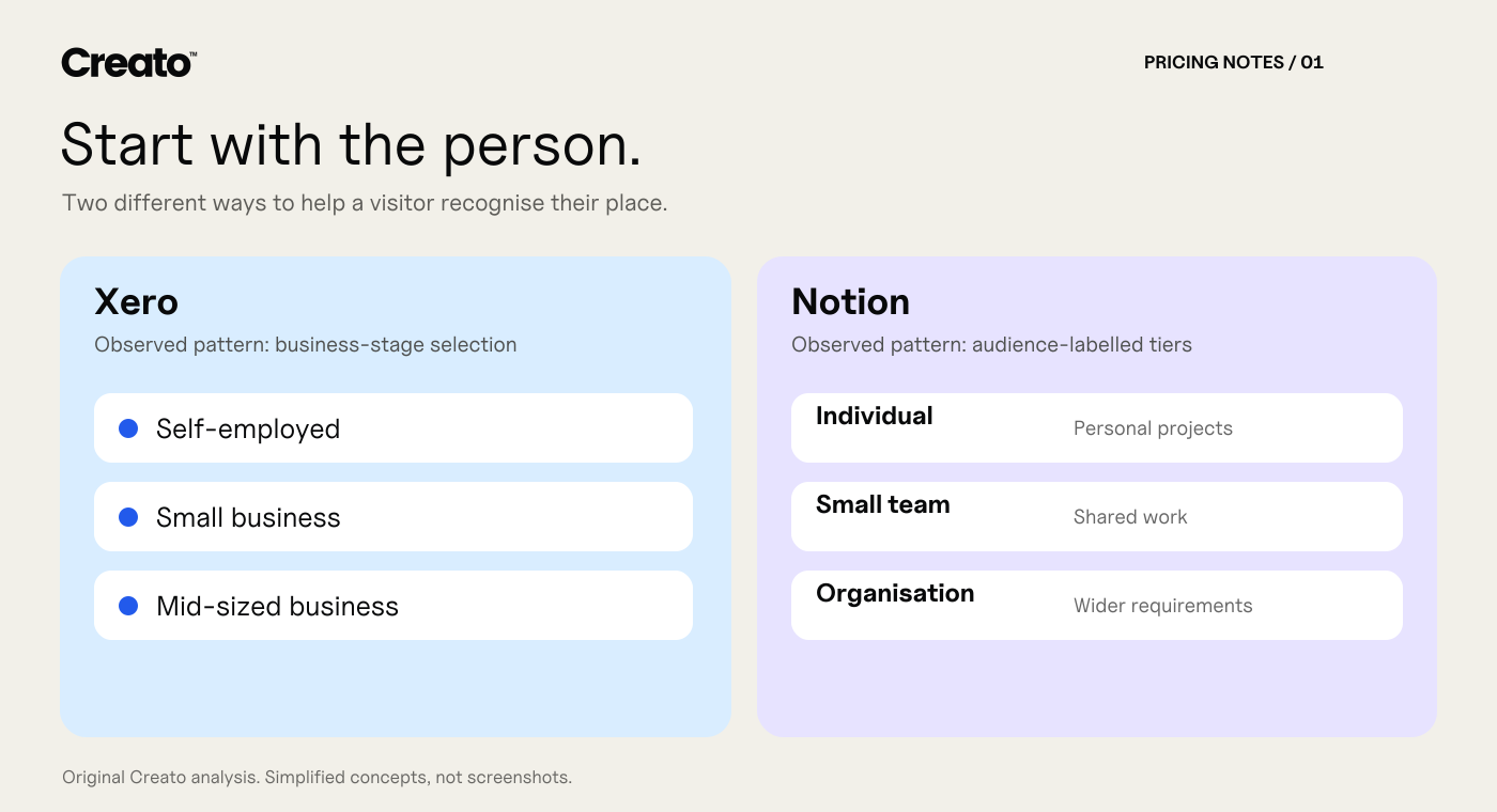
Two ways to introduce fit: begin with the customer’s situation, or explain the audience beside each plan. Original analysis diagram, not a reproduction of either page.
Xero: begin with the business
Xero’s Australian pricing page lets visitors select between self-employed, small-business and mid-sized-business contexts. It also offers a plan-recommendation route. The interesting idea is the order of the conversation: establish the customer’s situation before asking them to evaluate accounting features.
For a bookkeeping business, the equivalent might be “Sole trader”, “Growing team” and “More complex reporting”. Explain the scope behind each route. A business that spans categories still needs access to the full comparison; a helpful selector should not become a dead end.
Notion: give the tiers a human description
Notion’s pricing page pairs its Free, Plus, Business and Enterprise plans with short audience descriptions. That helps a visitor distinguish individual use from team collaboration and organisation-wide requirements before reading the longer comparison.
Write one honest “Best suited to…” sentence per service. Make the difference concrete. “For a new business launching its first website” is more useful than “For ambitious brands”. Treat the audience label as a starting point. A small team can still have complex security or support needs, so the actual inclusions must remain easy to inspect.
The design lesson: organise the choice around a customer’s circumstances. Keep an escape route for people whose project does not fit a box.
2. Make the differences easy to compare
Once someone finds a plausible option, they want to know what changes if they move up or down. This is where many pricing pages become exhausting: long checklists repeat the same benefits while the important restriction is buried in a footnote.
Use a short overview for the decision, with a deeper comparison for the details. Keep the order of features consistent. Where a limit matters, write the limit instead of replacing it with a tick.

Comparison becomes more useful when the page distinguishes both the level of service and the thing being purchased. Original analysis diagram.
Slack: let readers go deeper
Slack’s pricing page presents a plan overview and a more detailed feature comparison. Features are grouped, so a buyer can inspect the capabilities that matter to their team rather than relying on the plan name alone.
A managed IT provider could summarise the main support difference in each card, then compare response arrangements, devices covered and backup responsibilities below. On mobile, keep the plan name visible while someone checks a row. A comparison loses much of its value if the visitor forgets which column they are reading.
Webflow: explain what the purchase covers
Webflow’s pricing page distinguishes Site, Platform and Workspace plans and explains the relationship between site publishing and collaboration. The number of choices also shows a real design challenge: different purchasing dimensions can be difficult to understand on one page.
For a website project, separate the one-off design fee from ongoing hosting, maintenance and optional support. Present them together in a clear summary, but give each a name and a purpose. Your customer should be able to explain the quote to a colleague without translating your internal terminology.
The design lesson: make the meaningful differences visible. A longer feature table is useful only if people can find the answer they came for.
3. Explain the cost driver as well as the price
A price becomes difficult to judge when the unit is unclear. Is it per person, per project, per month, per location or per transaction? Is the monthly figure a monthly payment, or an annual commitment expressed as a monthly equivalent?
Put the charging unit beside the number. Explain the variables that could change the total. Where the model is genuinely complex, a worked example can be more helpful than a low starting figure.
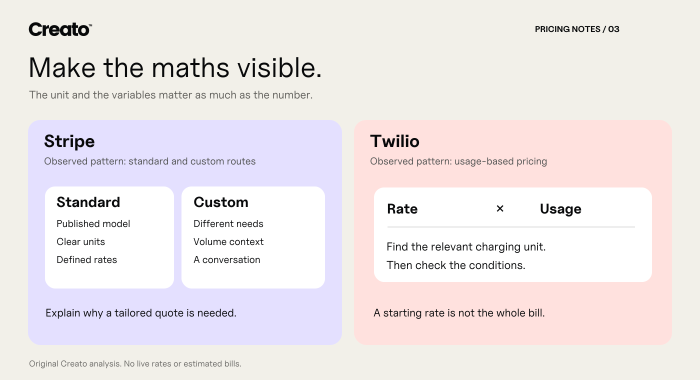
The useful pattern is to expose the pricing logic. This illustration deliberately contains no live rates or estimated bills.
Stripe: distinguish standard pricing from custom terms
Stripe’s Australian pricing page separates standard pricing from a custom route for businesses with larger payment volumes or unusual needs. It also breaks out pricing across products. The page gives buyers a starting framework while making clear that different services have different charging models.
An agency can use the same distinction to explain its defined project packages alongside a tailored-project route. State what moves a project into custom scope, such as multiple brands, complex integrations or extensive content production. “Custom” should communicate a reason, rather than conceal every useful detail.
Twilio: put usage at the centre
Twilio’s pricing page introduces a usage-based model and then directs visitors into product-specific pricing. That is an important distinction for a business whose bill depends on activity rather than a single flat subscription.
For a service with a defined allowance, show what counts towards it, how additional work is priced and when you will seek approval. A photography package could specify the shoot duration and delivered images. A maintenance plan could define the included support time and how extra requests are handled.
The design lesson: make the total understandable before someone has invested time in the enquiry or checkout.
A note for Australian businesses
For consumer-facing prices, the ACCC’s price-display guidance says the total must include taxes and unavoidable or pre-selected charges that can be quantified. If you also show a component price, the total must be at least as prominent. Its guidance distinguishes offers displayed only to other businesses, where GST need not be included in the total.
Treat this as a design requirement early in the project. Leave space for the billing basis, minimum commitment and material conditions. For an unusual pricing model or regulated service, get appropriate advice on the wording before launch.
4. Make the next step feel predictable
A button asks someone to make a commitment. The surrounding copy should explain the size of that commitment. Starting a free workspace, beginning a paid subscription, requesting a tailored quote and booking a sales demonstration are different actions.
Give the action a clear label, then answer the immediate follow-up question beside it. Does a trial require payment details? What happens when it ends? What information is needed for a quote? When will someone respond?
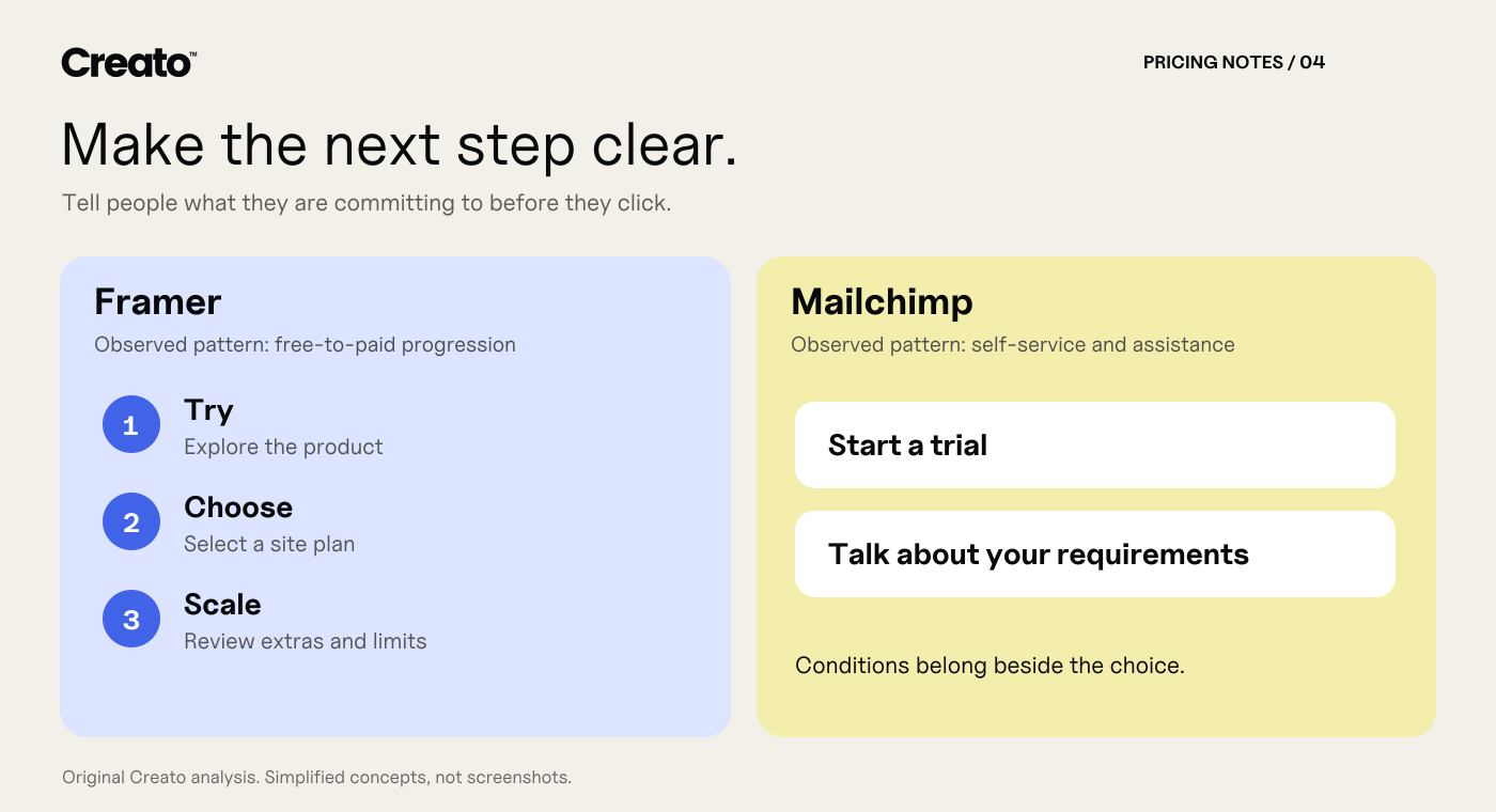
Different buying stages need different next steps. Explain the commitment close to the action. Original analysis diagram.
Framer: show the route from trying to buying
Framer’s pricing page places a free option beside paid site plans and a separate enterprise route. The page also explains additional editor charges and optional add-ons. This lets the reader see a progression, while the supporting detail matters when calculating the complete setup.
For a service business, a useful first step can reduce uncertainty without pretending the whole project is free. A clearly scoped discovery call or paid consultation can work well when the next action is explained accurately.
Mailchimp: support both self-service and a conversation
Mailchimp’s marketing pricing page combines trial and purchase routes with access to a demonstration or sales team. A contact-volume selector makes the pricing variable visible, while trial and overage conditions explain the limits. The trade-off is maintenance: selectors, promotional copy and conditions must stay consistent, or a sophisticated page can create more confusion than a simple offer.
Let straightforward customers request a defined package, while giving complex projects a useful enquiry path. Keep the form short enough to begin the conversation, and only promise a response time your team can consistently meet.
The design lesson: a clear next step needs clear consequences. The button and the explanation should work together.
What if every project needs a custom quote?
You can still create a helpful pricing page. Visitors do not always need an instant number. They do need to understand whether you are a plausible fit and what determines the investment.
For a Sydney architect, a brand studio or a specialist consultant, consider a page with these elements:
The scope you take on. Explain the kinds of projects and customers you serve.
The cost drivers. List the few decisions that materially change the fee, such as deliverables, complexity, research, revisions or implementation.
What is included. Describe the actual work and handover. Separate optional extras.
A real example. With permission, outline a past scope and its agreed fee, or use an explicitly hypothetical scenario. Do not imply an illustrative budget was a client result.
The quote process. Say what you need from the customer and what they will receive next.
If you publish a starting price or range, explain what it covers and the assumptions behind it. Keep it current. A price that gets someone through the form but bears little relationship to the work they need creates a harder conversation later.
Our website design brief template is a useful companion when the next step is gathering enough information to prepare a meaningful quote.
A pricing-page checklist worth using
Can a first-time visitor identify the option intended for them?
Are the most important inclusions and exclusions visible without opening several tooltips?
Is the currency, charging unit and payment schedule clear?
Are discounts, renewal prices and minimum commitments explained?
Does the mobile version preserve the plan names and comparison context?
Can someone use the selectors and buttons with a keyboard?
Does supporting text have sufficient contrast, including the small conditions?
Does each call to action explain what will happen next?
Can the customer reach a person when their requirements do not fit?
Does the enquiry or checkout record which option they selected?
Use the W3C’s contrast guidance when checking small labels and conditions. Accessibility belongs in the design of the choice itself, not just the colour of the main button.
Measure understanding, then measure outcomes
Before launch, ask a few people from your intended audience to choose an option and explain the total back to you. Watch where they hesitate. A preference for the prettiest card tells you less than whether they understand the offer.
After launch, track useful actions: qualified quote requests, completed purchases, plan-selection errors and repeated pricing questions. Compare like-for-like traffic where possible. Changes in campaigns, traffic quality or the offer itself can affect results, so avoid attributing every change to the design.
A lower enquiry count may be acceptable if fewer unsuitable prospects are contacting you and the right projects are easier to scope. Decide what success means for your business before you start changing the page.
Frequently asked questions
How many pricing options should a website show?
Use the number needed to represent genuinely different customer needs. Three is familiar, but it is not a universal rule. If two options describe your service honestly, do not invent a third simply to fill a layout.
Should the most expensive plan be highlighted?
Highlight an option only when you can explain why it suits a defined audience. A recommendation should help the customer choose. Avoid an unsupported “most popular” claim.
Do service businesses need to publish prices?
Not every service can be priced accurately before discovery. You can explain scope, fee drivers and the quoting process instead. If you do display prices, make the conditions and total clear for the relevant audience.
Can a pricing page improve website enquiries?
It can make the offer easier to evaluate, but results depend on the service, audience, traffic and wider website. Test the page and measure enquiry quality rather than assuming a particular layout will produce a fixed uplift.
Give customers a clearer way to choose
A useful pricing page turns the customer’s questions into the structure of the design. It makes fit, scope, cost and next steps easier to understand.
Creato helps businesses bring that clarity into their websites. Explore our web design services in Sydney or website design across Australia, then tell us about your project.


