Published
Author

Callum
Categories
Logo design


Ready to take it a step further?
Let's start talking about your project or idea and find out how Creato can help your business grow.
Seven directions to watch, with fourteen real identities showing where logo design could go next.
A forecast prepared in October 2026, informed by published design work from 2025 and 2026 and current studio case studies. These are directions we expect to develop, rather than a report on a year that has already happened.
A good logo should survive a tiny browser tab, a sun-faded shopfront and somebody asking for “the white version” five minutes before a print deadline. It also has to make people feel something. Quite a job for a few letters and a shape.
Looking towards 2027, some of the most interesting recent identities are giving those letters and shapes more personality. Walmart has leaned into custom lettering. The Roald Dahl Story Company has made mischief part of its typography. Google has softened the boundaries between its familiar colours. Cultural organisations are treating logos as things that can stretch, move and become physical objects.
For an Australian business planning a new identity, the useful question is what these ideas could solve. A café, a construction company and a software start-up have different audiences and different reasons to be remembered.
Here are seven logo design trends worth watching for 2027, each with two real-world examples and a practical test for your own brief.
1. Custom letterforms with a recognisable voice
The personality of a wordmark can live in surprisingly small decisions: the shoulder of an “r”, the width of a capital, the way two letters almost touch. We expect more attention to those details as businesses look for a name that feels distinctly theirs. The best results have a clear rhythm, even before you notice the clever bit.
Walmart: familiar letters, more character

Walmart, 2025. Identity: JKR. Image: JKR’s Walmart case study.
Walmart’s January 2025 refresh took inspiration from Sam Walton’s trucker hat. Its custom lettering feels sturdier and more characterful while the spark and blue-and-yellow palette maintain continuity. The close-up above makes the lesson tangible: even on an everyday embroidered cap, the name has enough personality to carry the application.
Rugiet: a name with vertical presence

Rugiet, presented in 2026. Design: Matt Willey and team, Pentagram. Image: Pentagram’s Rugiet case study.
Rugiet’s identity takes a different route: tall, stacked lettering turns the name into a strong vertical shape. Pentagram extended that logic into Rugiet Tall, a bespoke typeface developed with Commercial Type. The useful move is consistency between the logo and its supporting typography. The packaging feels related to the wordmark because both share the same proportions.
For a business with a distinctive name, carefully drawn lettering may be enough. Start with the letters that offer a natural opportunity; one memorable detail often works harder than six decorative ones. Before you approve it: read the name at phone-header and business-card size. Watch for clever combinations that accidentally spell something else.
2. Human quirks and deliberate irregularity
Perfect alignment has its place. So does a letter that looks as though it might wander off. Our next prediction is a continued appetite for controlled irregularity: unexpected curves, uneven rhythms and small gestures that make a logo feel authored. The approach is especially interesting for hospitality, entertainment and businesses selling creative experiences.
Roald Dahl: lettering with a mischievous streak

Roald Dahl Story Company, 2025. Design: Emily Oberman and team, Pentagram. Image: Pentagram’s case study.
Pentagram’s Roald Dahl identity gives oddness a reason to exist. The expressive lettering reflects the stories’ playful, sometimes darker character. Its supporting Fantastic Mr. Font includes alternate letters and different tonal possibilities. The wordmark has a recognisable personality, while the wider typography can become more restrained or more exuberant according to the audience.
LenLen: the warmth of something handmade

LenLen, presented in 2026. Design: Andrea Trabucco-Campos and team, Pentagram. Image: Pentagram’s LenLen case study.
For Thai restaurant LenLen, Pentagram built an identity around casual imperfection. Hand-drawn bubble lettering, slanted strokes and informal handwriting share space with straightforward Arial. The large, loose wordmark over the restaurant’s red interior shows how the lettering can feel welcoming and tactile. The surrounding material helps the logo’s looseness read as a deliberate part of the restaurant’s character.
Borrow the connection to the business. A bakery might explore a founder’s lettering; a specialist consultancy might use one unexpected detail. Randomly distressing a font rarely creates a meaningful personality. Before you approve it: ask someone outside the project to read the name, then test its smallest version. Keep the quirks that help recognition.
3. Heritage remixed with a lighter touch
There is a more interesting way to use nostalgia than adding a vintage badge to everything. Look for something the business genuinely owns: an old sign, a founder’s signature, a familiar emblem. For 2027, we expect more identities to revisit those assets with confident scale, cleaner composition and fewer competing details.
Ach. Brito: factory lettering, freshly framed

Ach. Brito, 2025. Design and image: Studio Eduardo Aires.
For Ach. Brito’s 2025 identity, Studio Eduardo Aires referenced the name painted on the Portuguese soap maker’s former factory. The new typographic logo uses Plaak, chosen for its relationship to that inscription; the floral seal was simplified and rebalanced. On the red packaging, historical cues sit within a striking contemporary colour treatment. Heritage can be visually bold.
Coca-Cola: giving an existing asset room

Coca-Cola. Identity: JKR. Image: JKR’s current Coca-Cola case study.
JKR’s Coca-Cola case study shows the Arden Square brandmark brought back into prominence, alongside the familiar script and Dynamic Ribbon. The signage gives the red square generous space and a simple architectural setting. The idea is useful for smaller businesses too: a recognisable old asset can feel current when the composition around it becomes more decisive.
An established Australian business may have excellent starting material in delivery dockets, shopfront photographs and packaging. Bring it into the brief. New businesses should avoid decorative dates or crests that suggest a history they do not have. Before you approve it: identify the exact familiar feature being preserved and check that it survives in one colour.
4. Colour gradients inside stronger silhouettes
Gradients give a simple shape a sense of light, softness or movement. We expect them to remain attractive for screen-led brands in 2027, especially where a compact icon carries a lot of personality. Two recent technology identities demonstrate how colour can evolve around a recognisable structure.
Google: softer transitions, the same recognisable G

Google’s company-wide gradient G, September 2025. Image: Google’s official announcement.
In September 2025, Google announced its gradient G as the company-wide icon, after introducing it for Search earlier that year. The familiar colours remain, with blended transitions between them. The established G silhouette does the structural work, allowing the surface treatment to change without demanding that people learn an entirely different symbol.
Microsoft 365: colour with folds and depth

Microsoft 365, October 2025. Design and image: Microsoft Design.
Microsoft’s October 2025 icon refresh combines richer gradients with smoother folds and curves. Familiar letter plates remain, while some detail is simplified: Word’s four horizontal bars became three. These are product icons rather than a new Microsoft corporate logo, but the design lesson transfers. More expressive colour works best when the identifying structure stays clear.
Start with a form that can survive without the glow. Embroidery, laser engraving and one-colour sponsorship signage still matter to many Australian businesses. Before you approve it: review full-colour and one-colour versions together, and have the actual supplier check the intended size. A beautiful monitor image is only one part of the job.
5. Flexible families with a clear centre
A rigid logo arrangement can struggle across a website header, social avatar and tall shop sign. A business with several services has another challenge: related identities need enough difference to be useful. We expect more briefs to consider the behaviour of the whole family from the outset.
Design Doha: a typographic system that can adapt

Design Doha Biennial 2026. Design: Samar Maakaroun and team, Pentagram. Image: Pentagram’s case study.
Design Doha Biennial’s 2026 identity treats Arabic and English as equal participants in a flexible typographic system. Extended strokes connect the letterforms, creating a shared visual structure. The striking part is how the system can change its expression while remaining recognisably connected to the same central idea.
Sada and Mada: siblings with their own roles

Sada and Mada, presented in 2026. Design: Samar Maakaroun and team, Pentagram. Image: Pentagram’s case study.
Sada and Mada extend the Doha Design District identity into an events and exhibition space and a maker’s space. Shared letterform logic connects the siblings; orange and mint help distinguish them. This is brand architecture rather than simply a resized logo, but it demonstrates the same discipline: define what stays consistent before allowing variation.
Most small businesses need a simpler toolkit: a primary wordmark, an alternate arrangement and a compact mark. Our guide to logo variations explains those choices. Before you approve it: compare every version at realistic sizes. Ask for clear rules about which belongs where, especially when a compact symbol appears without the full name.
6. Motion considered from the first sketch
A logo might assemble, open, stretch or settle into place. The best reason to animate it is that the movement expresses something useful about the business. For 2027, we expect more designers to plan that behaviour early, alongside the still mark and its practical applications.
DEMO 2025: typography built for the screen

DEMO 2025. Frame from the official motion identity by Studio Dumbar/DEPT.
DEMO 2025 retained its core logo and typography while introducing a distorted globe and extending the letters into the interactive DEMOVERSE. The frame above is taken from the studio’s actual animation. Large, clear letters provide a recognisable anchor for the more changeable visual world around them, an important consideration when the work appears on public screens.
De Bijloke: a mark that behaves like sound

De Bijloke, presented in 2026. Design: Marina Willer and team, Pentagram. Still image: Pentagram’s motion-led case study.
For music venue De Bijloke, Pentagram developed a swooping identity informed by experimental musical notation and oscilloscope imagery. The looped forms give movement a subject: sound. A generative pattern tool extends the system across programming. The still above shows the visual language; the linked case study shows how it develops through motion.
A delivery service might explore purposeful movement; a maker could build the mark in the same sequence as a product. Decide where the animation will actually appear. Before you approve it: check the first frame, final frame and static fallback. Agree on duration, looping, formats and reduced-motion behaviour with the people implementing it.
7. Symbols with a story you can point to
There is plenty of room for abstraction in logo design. The strongest abstract marks often have a concrete starting point. A business’s process, setting or product can provide a more specific idea than another familiar industry icon. Two recent cultural identities make that connection unusually visible.
YouMe Kyoto: craft becomes a symbol

YouMe Kyoto Triennale, presented by Pentagram in October 2026. Design: Harry Pearce and team. Image: Pentagram’s case study.
The YouMe Kyoto Triennale identity draws on an interlocking three-part Japanese timber joint. The idea connects art, craft and design with a physical way of making things. Open and solid versions can appear in different materials and as three-dimensional objects. That gives the symbol a life beyond a flat graphic on a poster.
Queens: a local landmark meets a global game

Queens Tourism Council, 2026. Design: Paula Scher and team, Pentagram. Image: Pentagram’s case study.
For the Queens Tourism Council’s 2026 identity and campaign, Pentagram reimagined the borough’s Unisphere as a football. The connection joins a recognisable local landmark with the World Cup context. Bold lettering gives it immediate presence at street scale. The symbol has a story, but its simple circular shape remains visually convincing before that story is explained.
Think about the joint a cabinetmaker uses or an unusually recognisable local structure. Simplify carefully, and involve the relevant communities when ideas draw on community-owned stories or motifs. Before you approve it: ask what makes the idea specific to this business. Then remove the explanation. The mark should still hold together.
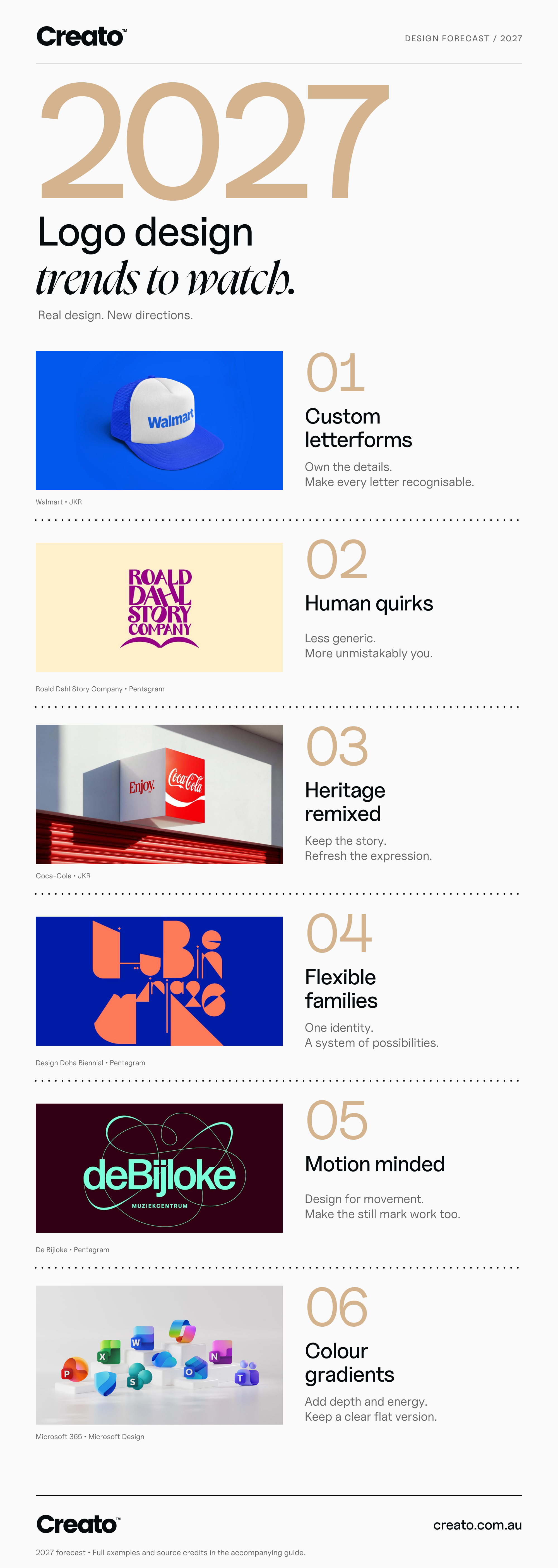
Six directions from Creato’s 2027 forecast. Real-world identities and their designers are credited within the infographic.
Share this image on your site
Use the code below to link to this infographic and credit Creato.
Third-party examples remain the property of their respective owners. Crediting Creato does not grant permission to reuse those examples.
Which logo trend should your business use?
Start with the problem your current identity has. Perhaps the name is hard to read, the logo disappears in a feed, the design feels disconnected from the service, or different suppliers keep improvising new versions.
Then choose a direction that addresses that problem. Expressive lettering may suit a hospitality brand with a lively personality. A heritage-led refinement may make sense for an established family business. A flexible set of layouts can solve practical problems without changing the central idea at all.
Before writing a brief, gather four things:
Your actual applications. Include a phone screenshot, signage dimensions and the packaging or uniform the logo needs to work on.
What customers already recognise. Keep useful colour, shape or lettering cues in the conversation.
A small set of relevant competitors. Check whether the proposed direction would make you easier to distinguish.
A realistic handover list. Agree on the layouts, vector artwork, colour versions and any motion assets you will need.
You can combine compatible ideas, but every extra treatment adds something to maintain. A custom wordmark with one strong detail and a sensible set of variations may serve a business exceptionally well.
Questions worth asking before a 2027 redesign
Will a fashionable logo date quickly?
It can if its appeal depends entirely on a recognisable style of the moment. A clear name, a distinctive shape and a meaningful connection to the business give you more to work with over time. Use trends to explore possibilities, then judge the result against your own brief.
Do I need a new logo to look current?
Sometimes the useful change is elsewhere: better typography, clearer layouts, stronger photography or a more consistent set of applications. Review the surrounding identity before assuming the logo has to change. Creato’s brand design approach considers how those pieces work together.
Should every business have an animated logo?
Only if there is a practical place to use it. A business publishing regular video may get good use from a short motion asset. Another may get more value from excellent signage artwork and a reliable small-size mark. Let the use case set the scope.
Make the next version unmistakably yours
The exciting opportunity for 2027 is the range of possibilities: expressive lettering, purposeful colour, a thoughtful connection to history or a symbol rooted in how your business works.
If you are planning a new identity, bring your story and your real applications to the brief. Explore Creato’s logo design services in Sydney to start a conversation about a mark that fits your business and the places customers will meet it.


