Published
Author

Callum
Categories
Logo design

Ready to take it a step further?
Let's start talking about your project or idea and find out how Creato can help your business grow.
The arrow in FedEx, the bear inside Toblerone’s mountain and the hidden C in Carrefour all turn the background into part of the logo. Each gives you a second image to discover without adding a separate icon beside the name.
That is the appeal of a clever negative space logo. The shape you notice first and the image you find afterwards share the same edges. When the relationship is well resolved, the design feels economical rather than crowded.
Below, we look closely at three genuine examples and the decisions that make them work. These international identities are design references, not Creato projects. We then bring the lessons back to a real Creato wordmark and the practical questions to ask when developing your own logo.
Explore Logo Design With Creato
How a negative space logo reveals a second image
Positive space is the shape you see as the foreground. Negative space is the background around and within it. In a hidden-image logo, part of that background also becomes a recognisable shape.
The distinction is easy to test. Look for the second image and ask which edges define it. If the surrounding letters or symbol create its outline, negative space is doing the work. A small icon placed on top of another shape is a different technique.
The most useful examples still make sense before the detail is found. The company name remains readable, or the main symbol remains recognisable. The hidden image adds another layer without becoming an obstacle.
FedEx puts an arrow between two letters
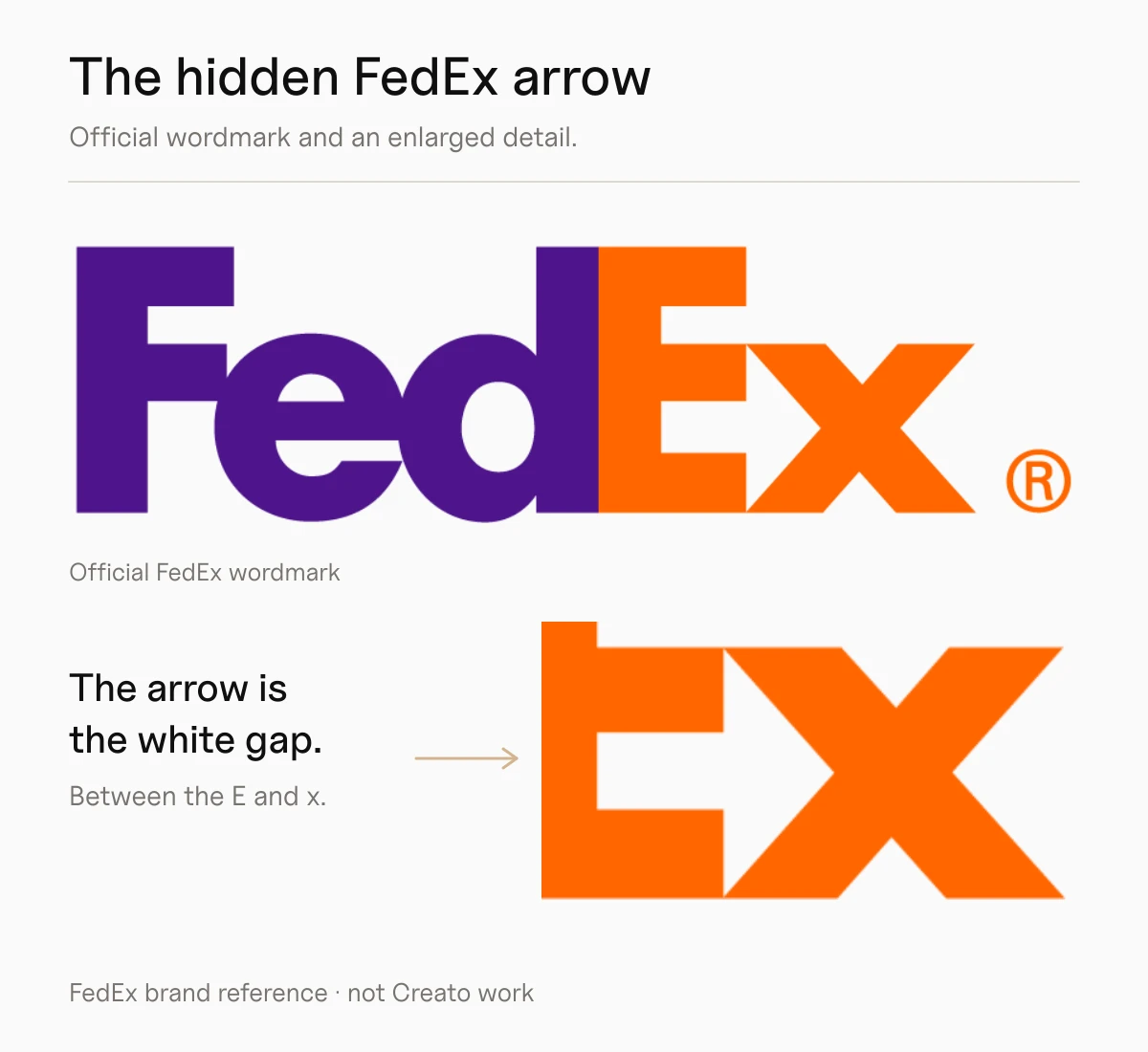
FedEx logo, shown for design analysis. FedEx identifies the hidden arrow in its own brand commentary.
Look between the capital E and the lower-case x. The E provides horizontal boundaries, while the diagonals of the x form the point of a right-facing arrow. There is no extra arrow sitting above or below the word.
The fit between the letters matters. The empty area has to read as an arrow while the E and x continue to read as letters. This is why the idea cannot be separated from the drawing and spacing of the wordmark.
The lesson for your logo is to look for an opportunity already present in the name. An initial or a pair of neighbouring letters may offer a useful shape. Start there before adding another symbol. The FedEx example also shows that a hidden detail can remain secondary: the name is still the main thing you read.
Toblerone hides a bear inside the mountain
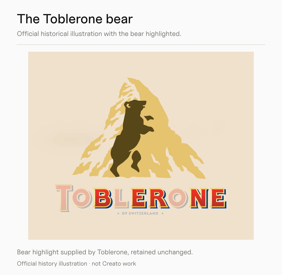
Toblerone’s own history illustration highlights the bear to reveal the detail. This is an explanatory graphic from the brand, rather than its standard unannotated logo. View the official history.
In the familiar mountain emblem, an upright bear is formed within the pale areas of the mountainside. Find the head near the upper part of the slope, then follow the body and raised foreleg downwards. The larger outline continues to read as a mountain.
Both Toblerone’s history and brand owner Mondelēz identify the bear. The mountain-and-bear emblem shown here is a historical reference from Toblerone’s own archive.
The lesson for your logo is to make the second shape belong inside the first. Here, the uneven contours can read as mountain detail and as an animal silhouette. The bear does not require a second badge or another line of text. For your own identity, look for a meaningful relationship between the two subjects rather than hiding an unrelated object simply because it fits.
Carrefour turns the background into its initial

Carrefour’s official history illustration shows how the C is built into the symbol. Source and logo history.
You may notice the red and blue shapes first. Look instead at the pale area between them and a capital C appears. The letter is not a coloured character laid over the symbol; it is defined by the surrounding shapes.
Carrefour’s own history explains that the mark was created around its initial, with red on the left and blue on the right. The accompanying illustration is particularly useful because it lets you trace the relationship from letter to complete symbol.
The lesson for your logo is that a hidden letter can carry the idea. You do not always need two objects or an elaborate visual joke. A well-chosen initial can give an abstract-looking symbol a direct connection to the business name.
What these three logos have in common
Each example gives the same boundary two jobs. In FedEx, a letter edge also defines an arrow. In Toblerone, mountain detail also describes an animal. In Carrefour, the coloured symbol also outlines the initial.
That shared boundary is a useful starting point for a Creato brief. Describe the name, what the business does and the associations that genuinely matter. Then consider whether those ideas can share a simple outline.
Keep the main identity clear. If the company name becomes difficult to read, or the symbol only makes sense after a lengthy explanation, the hidden image may be costing more than it contributes.
A Creato example shows why the smaller spaces still matter

CUBIQ Group wordmark by Creato, presented over architectural photography. Explore Creato’s logo design portfolio.
CUBIQ Group uses deliberate openings in its custom lettering. The upper section of the B opens to the left, and the Q has a diagonal tail separated from the main letter by a narrow gap.
This is not a hidden-picture logo. It shows another important use of negative space: giving the lettering its character while keeping the name readable. Those gaps still need to survive at the sizes where the identity will be used.
The practical question is the same whether the opening makes an arrow or separates a letter stroke. Does the important detail remain clear on a small website header, a business card or the artwork supplied for signage?
Bring the right ingredients to your Creato brief
You do not need to arrive with a finished visual puzzle. Give Creato the information that makes a concept relevant.
Your business name and pronunciation. Include the exact spelling, any initials you use and whether the full name must appear in the main logo.
The idea worth communicating. Choose a meaningful association, such as connection, precision or a particular service. Explain why it matters to your customers.
The audience and tone. A playful discovery may suit one brand, while another needs a more restrained identity.
The real applications. Tell us about website headers, packaging, uniforms, vehicles and signage, especially the smallest or most demanding use.
The references you like. Explain the principle you admire. “I like how the arrow is part of the lettering” is a more useful direction than asking for another brand’s logo with a different name.
Creato can discuss whether a hidden-image approach suits your identity or whether a strong wordmark or straightforward symbol would communicate the business more clearly. Explore our logo design services to see the range of approaches.
Check the idea before approving the artwork
A concept presentation should help you inspect the logo, not conceal its weaknesses behind an attractive mockup. Use these checks when reviewing the options.
Read it without the explanation. The main name or symbol should work even when someone does not notice the hidden image.
Find the second shape. Check that it is recognisable and relevant, rather than a vague resemblance that needs to be repeatedly explained.
Reduce it to a real size. Look at the intended website header and smallest printed use. Fine gaps can become much harder to distinguish.
Review one-colour and reversed versions. Check the supplied artwork on plain light and dark backgrounds. Colour should not be the only thing separating important forms.
Ask for the production proof. For embroidery, cut vinyl or engraving, have the supplier assess the actual artwork, material and size before manufacture.
A logo system may need different variations for compact spaces and wider layouts. Record the approved versions, minimum sizes and surrounding clear space in a brand style guide. Clear space is the outer margin around the logo; it cannot rescue a hidden detail that has become too small inside it.
Keep the final files practical as well. Our logo file format guide explains scalable vector artwork and the raster exports you may need for everyday use.
Create a logo with an idea worth keeping
A clever hidden image can give a simple mark an extra layer of interest. It earns its place when the business name remains clear, the association makes sense and the detail holds up beyond the presentation.
Bring Creato your name, your audience and the places the logo needs to work. We can explore an identity with the right balance of character, clarity and practical use.


